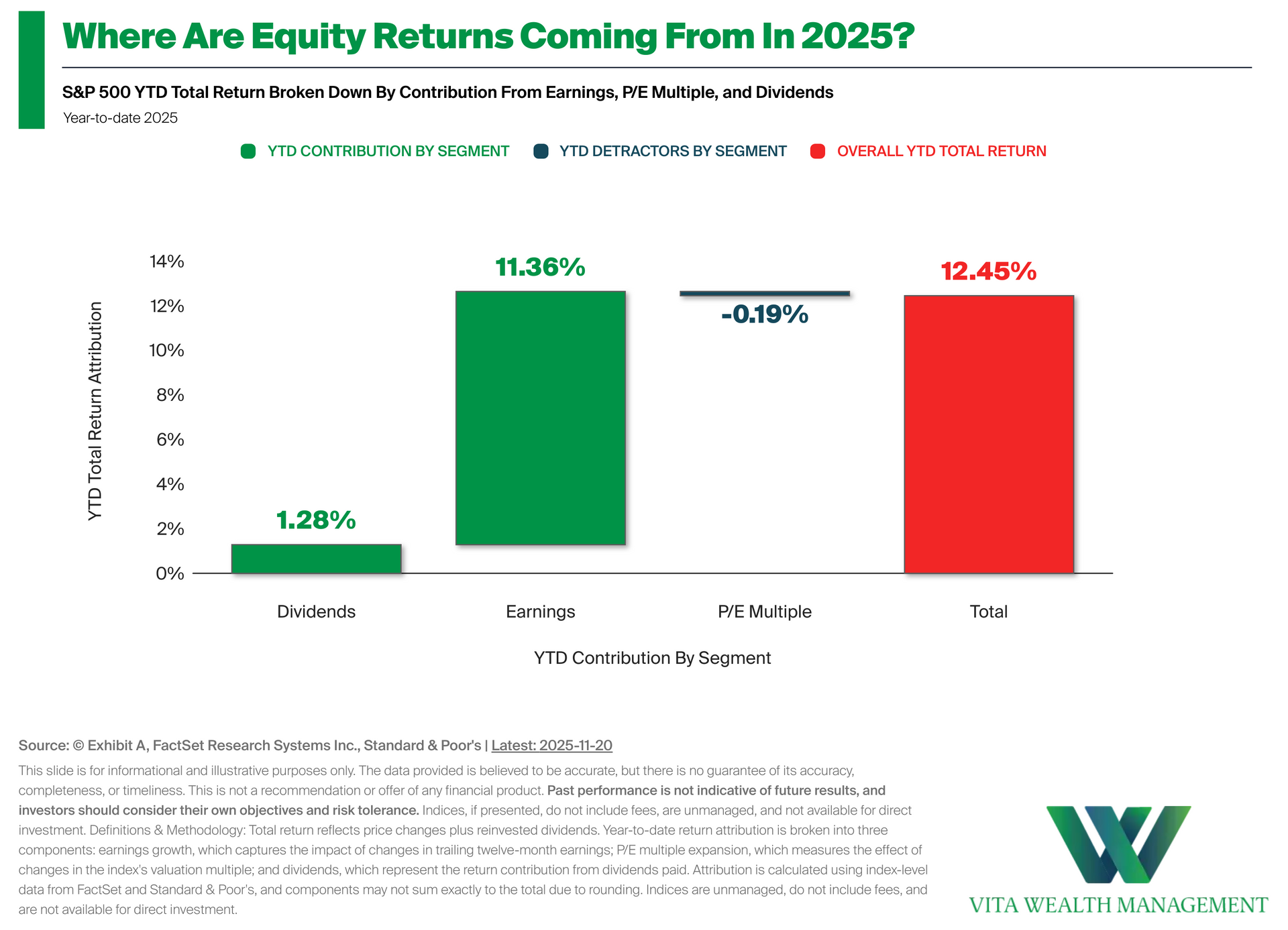
•Measuring Return Drivers in 2025: The chart shows the S&P 500's total return year-to-date broken down into the contribution from three segments: earnings growth, P/E multiple, and dividends • A Recent Look at the Data: Year-to-date, the S&P 500's total return is 12.45%. • Investment Implications: Breaking down returns this way helps show whether market gains are being supported by underlying fundamentals or shifts in valuation.
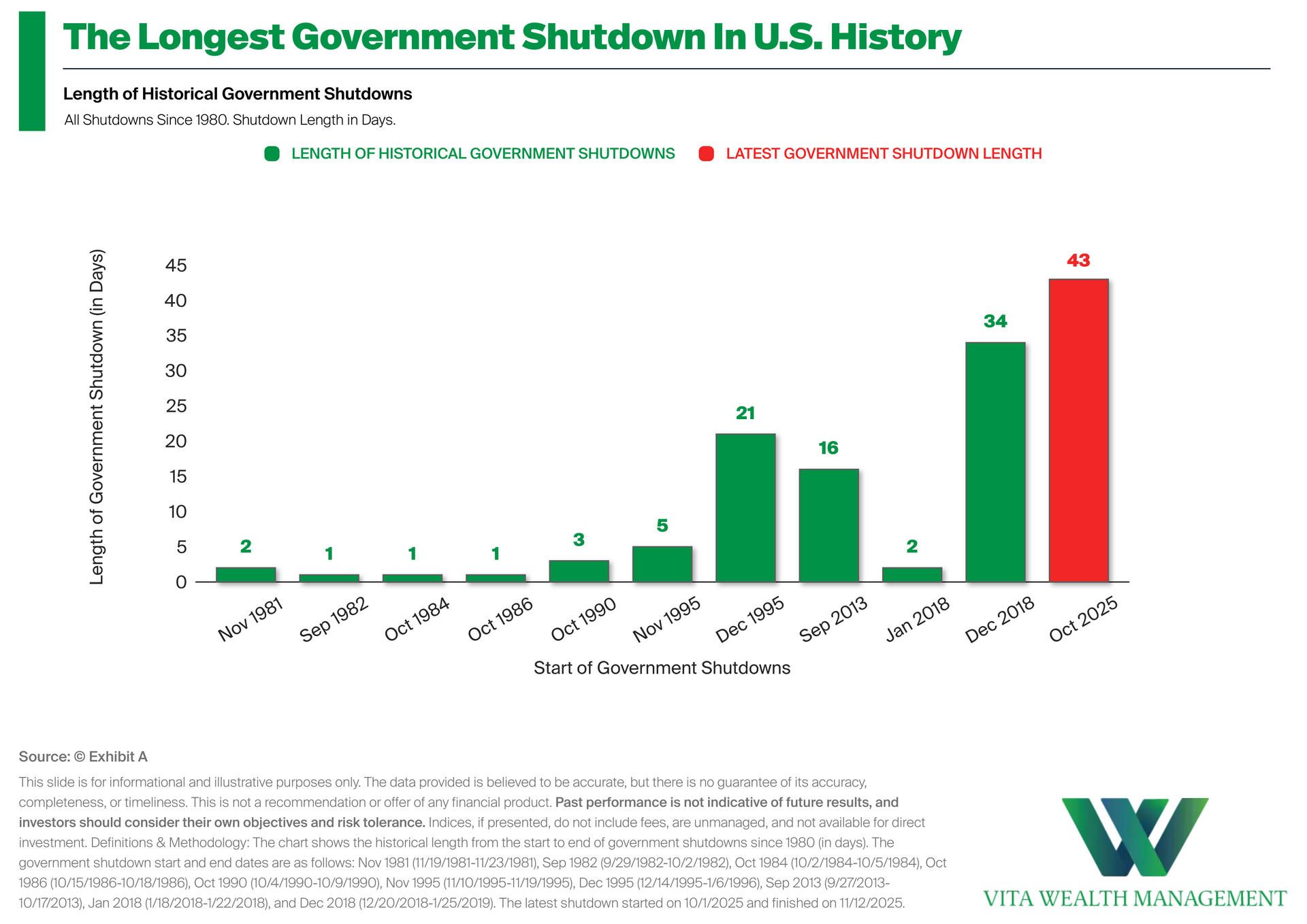
•Measuring the Length of Historical Shutdowns: The chart shows the duration of every government shutdown since 1980. • Latest Shutdown Duration: The latest shutdown lasted 43 days making it the longest in U.S. history. • Putting Things in Context: Shutdowns are not new and have happened at various points over time. Seeing how they compare historically can help us understand that periods like this, while attention-grabbing, are part of the normal ebb and flow of the economic cycle.
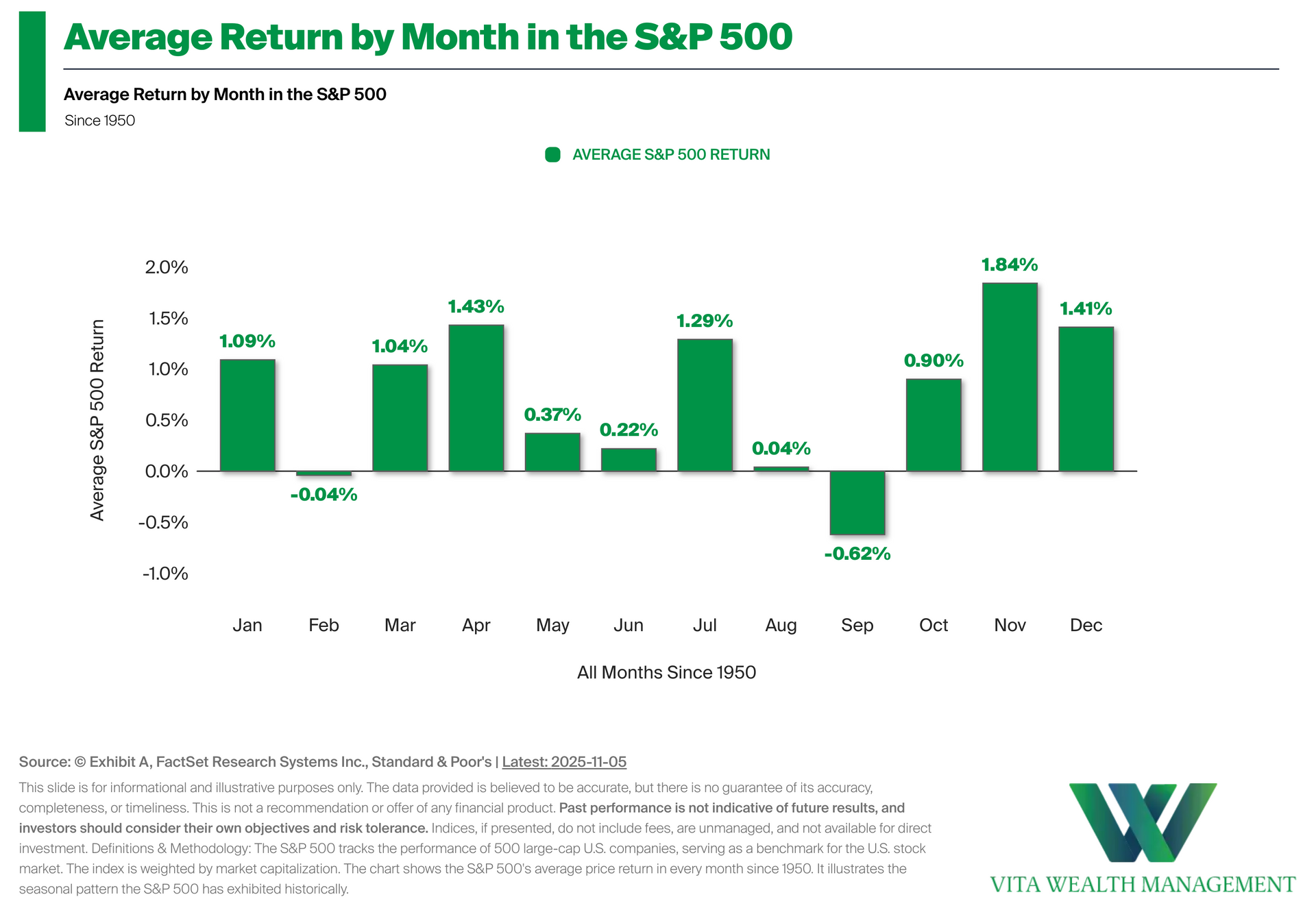
•What is Seasonality?: Seasonality refers to recurring trends in market performance during specific times of the year. The S&P 500 has historically shown seasonal patterns driven by factors such as earnings seasons, macroeconomic events, and investor behavior. However, these trends may vary each year and are not guaranteed. • Investment Implications: Seasonality provides historical context for understanding market patterns throughout different months of the year. However, seasonal patterns should be viewed as historical observations rather than predictive indicators, as market conditions and external factors can influence actual results each year.
•Valuations In Dotcom Bubble vs Today: The chart shows the forward P/E ratios of select blue-chip names in the S&P 500 during the dotcom bubble compared with their current valuations. • A Look at the Data: At the March 2000 peak, leading tech names like Cisco and Oracle traded at extreme valuation multiples, with forward P/Es well above 100x. Today's largest S&P 500 constituents trade at far lower levels. • Investment Implications: T he comparison highlights that while valuations have expanded, today's market environment is supported by stronger fundamentals, more diversified earnings, and greater profitability than during the 2000 cycle.
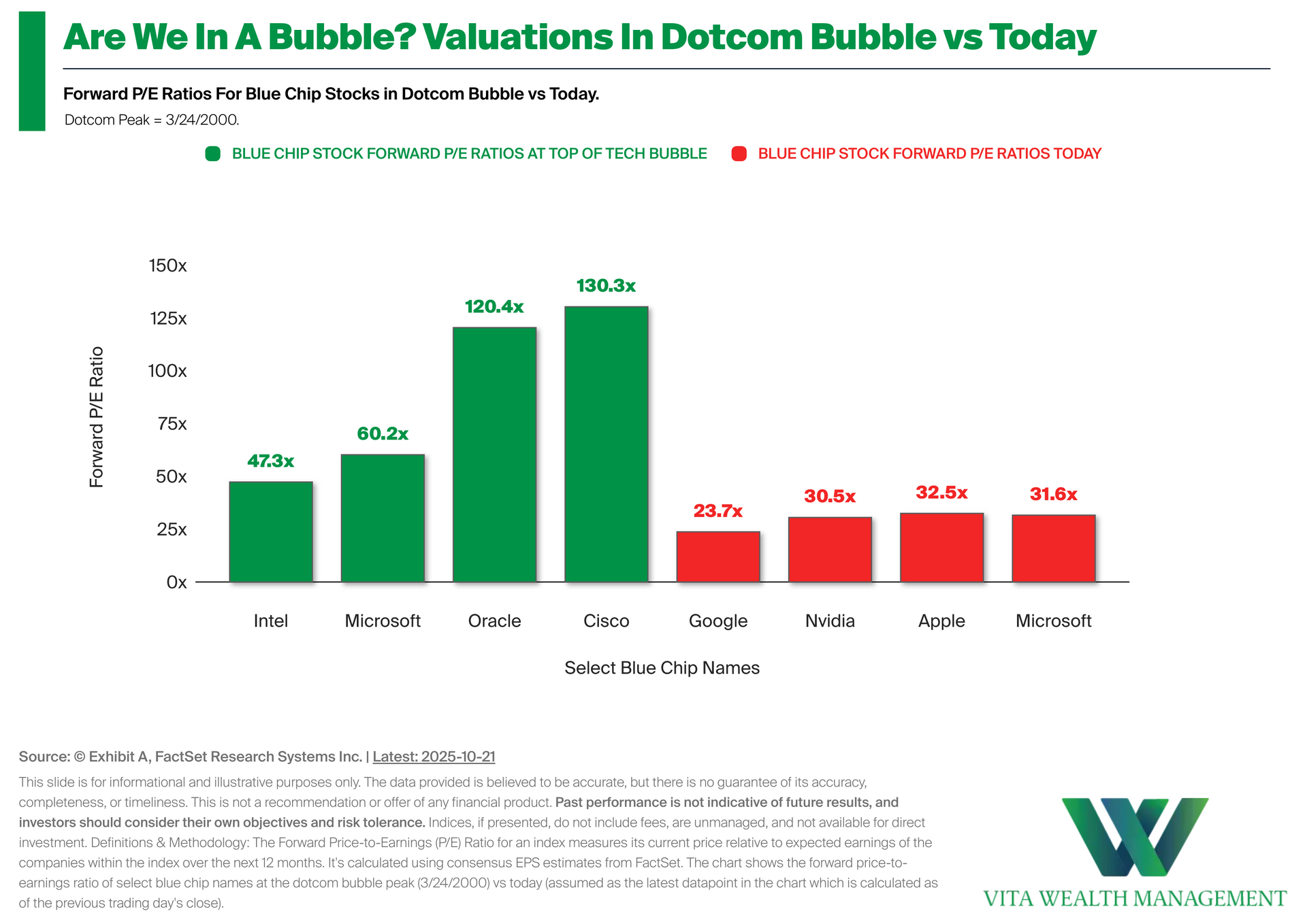
•Valuations In Dotcom Bubble vs Today: The chart shows the forward P/E ratios of select blue-chip names in the S&P 500 during the dotcom bubble compared with their current valuations. • A Look at the Data: At the March 2000 peak, leading tech names like Cisco and Oracle traded at extreme valuation multiples, with forward P/Es well above 100x. Today's largest S&P 500 constituents trade at far lower levels. • Investment Implications: T he comparison highlights that while valuations have expanded, today's market environment is supported by stronger fundamentals, more diversified earnings, and greater profitability than during the 2000 cycle.
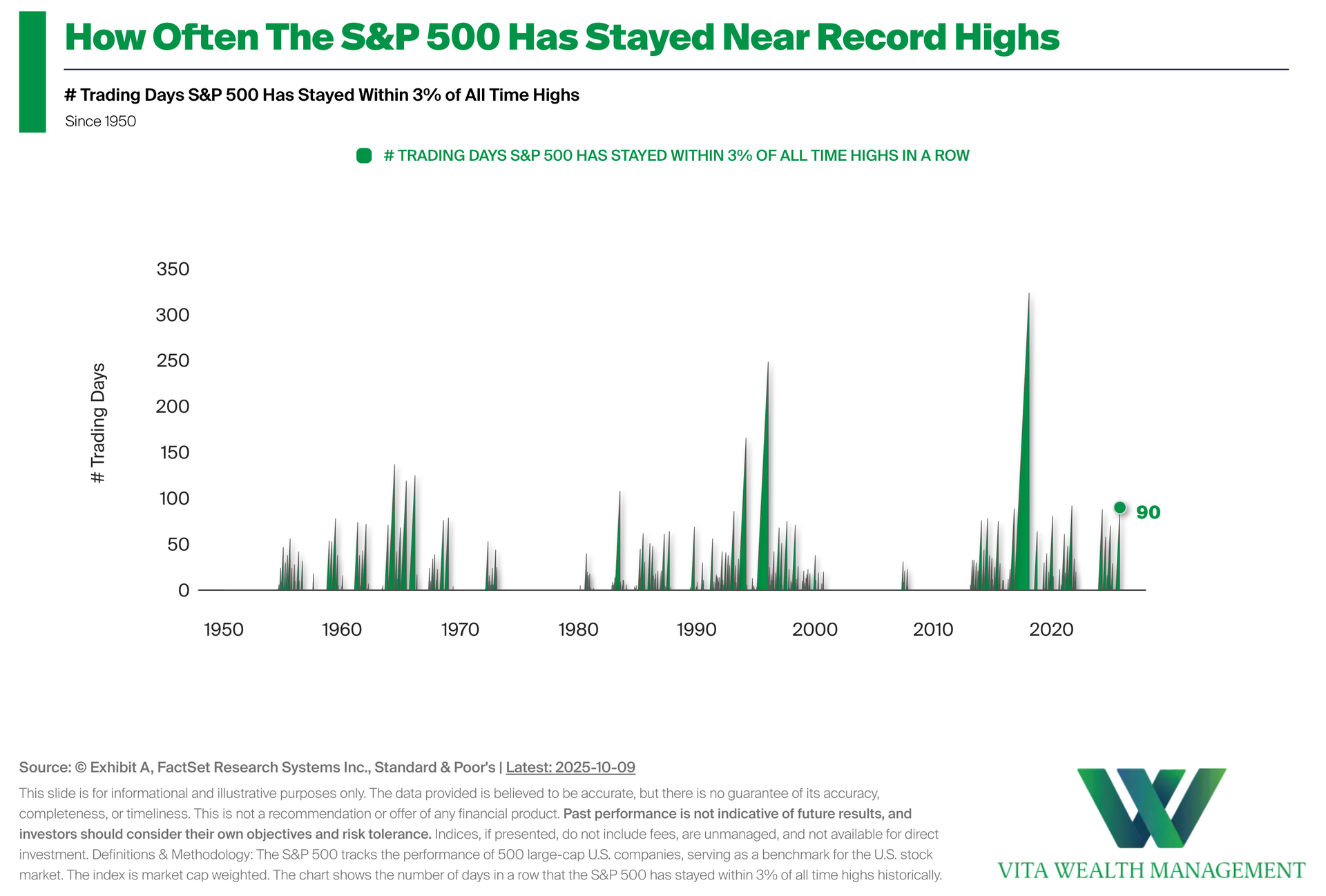
•Measuring Time At or Near All-Time Highs: The chart tracks how often the S&P 500 has stayed within 3% of its all-time highs over time, highlighting periods of extended market strength. • A Current Look at the Data: As of October 9, 2025, the S&P 500 has spent 90 trading days in a row within 3% of an all-time high. • Investment Implications: While data shows that markets have historically remained near record highs for extended periods during strong economic cycles, investors should remember conditions can change and past trends may not repeat.
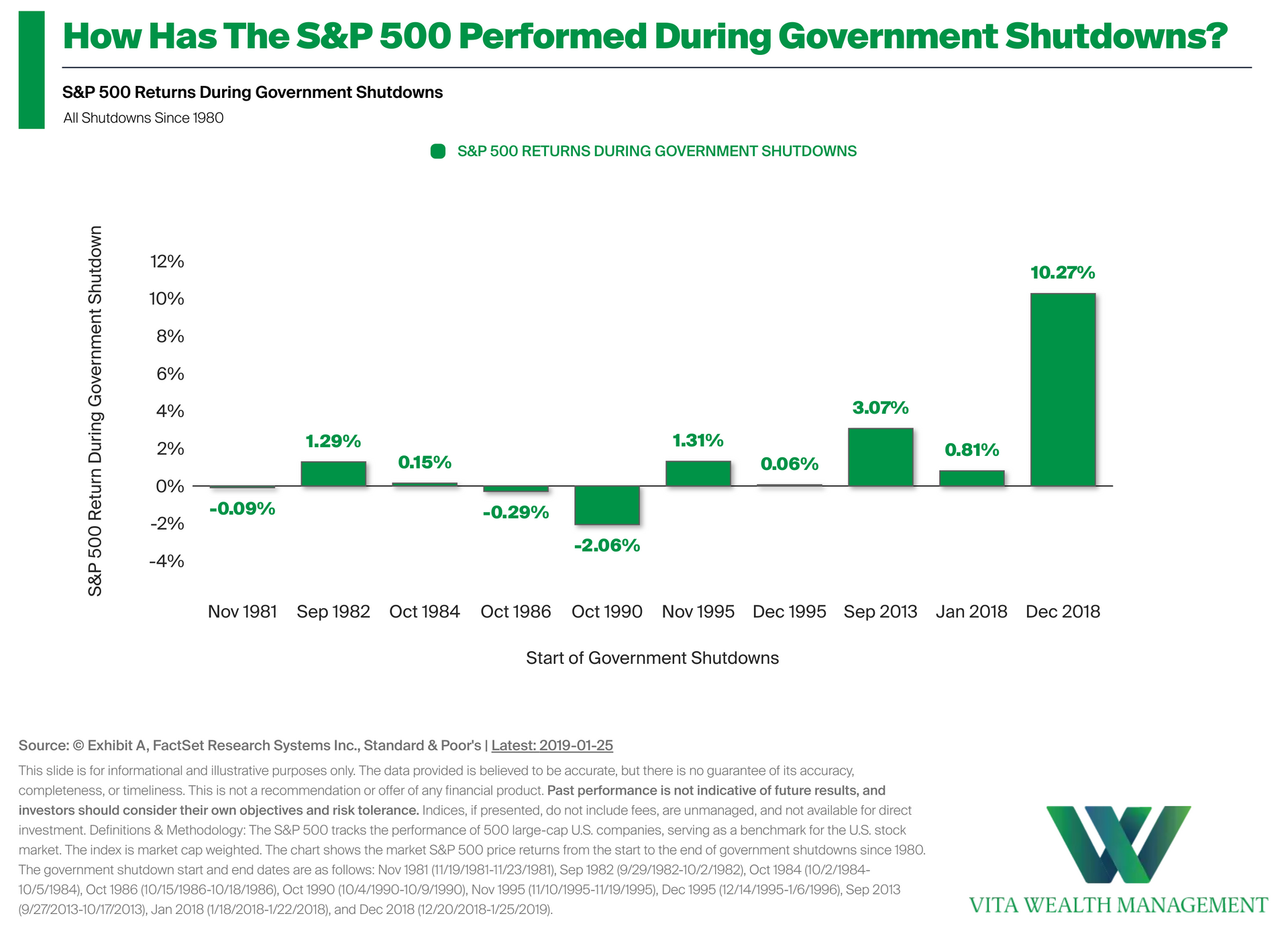
•Understanding the Data: This chart tracks how the S&P 500 performed during past U.S. government shutdowns. While shutdowns often dominate the headlines, market returns during these periods have varied widely. • A Look at the Numbers: In 7 of the past 10 shutdowns since 1980, the S&P 500 actually generated a positive return, showing that markets have often looked past the noise. • Investment Implications: The data highlights that short-term political events have not consistently dictated market direction. For investors, it's a reminder that tuning out the noise has historically been more effective than reacting to it.
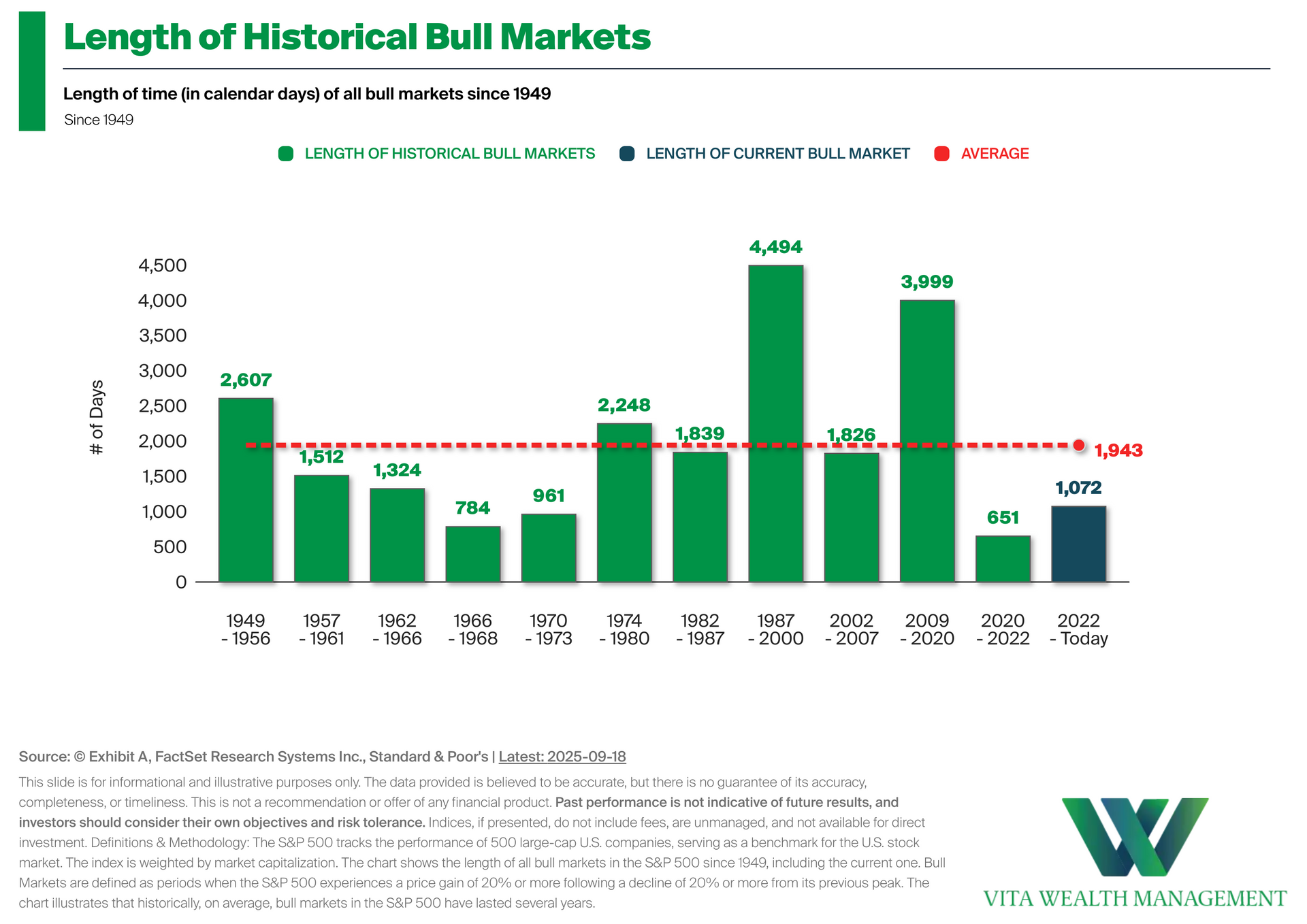
• Length of Historical Bull Markets: This chart shows the length of past S&P 500 bull markets, measured in calendar days since 1949. While each cycle varies, history reminds us that bull markets can endure for years. Staying invested during these periods of growth has been a key driver of long-term portfolio outcomes and overall market recovery. • A Recent Look at the Data: We have been in a bull market for 1,073 days since the 10/12/2022 low. This compares to the average length of 1,943 days in all bull markets since 1949. • Investment Implications: For investors, the chart highlights how the duration of bull markets has varied over time, with some lasting several years.
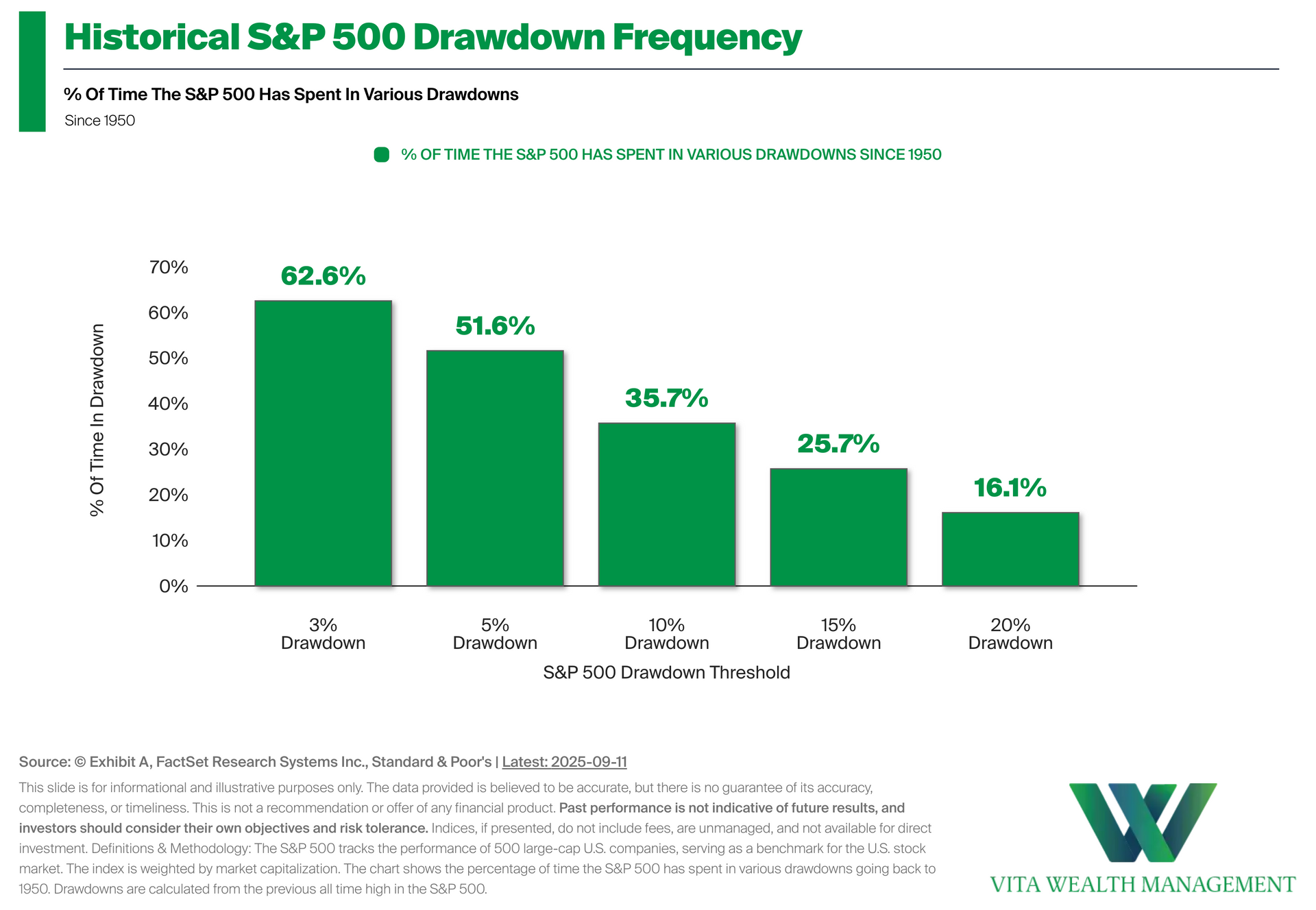
• S&P500 Drawdown Frequency: The chart shows how often the S&P 500 has been in drawdowns of varying sizes since 1950, measured from prior all-time highs. It highlights that periods of pullback are a normal part of market history. • A Look at the Data: The S&P 500 has spent more than 60% of the time at a 3% drawdown or greater, and over half the time at a 5% drawdown or greater. Even deeper declines, such as 10% or more, have occurred a meaningful share of the time. • Investment Implications: These historical drawdown frequencies provide context for market volatility. This shows that declines are common and often temporary within long-term investing.
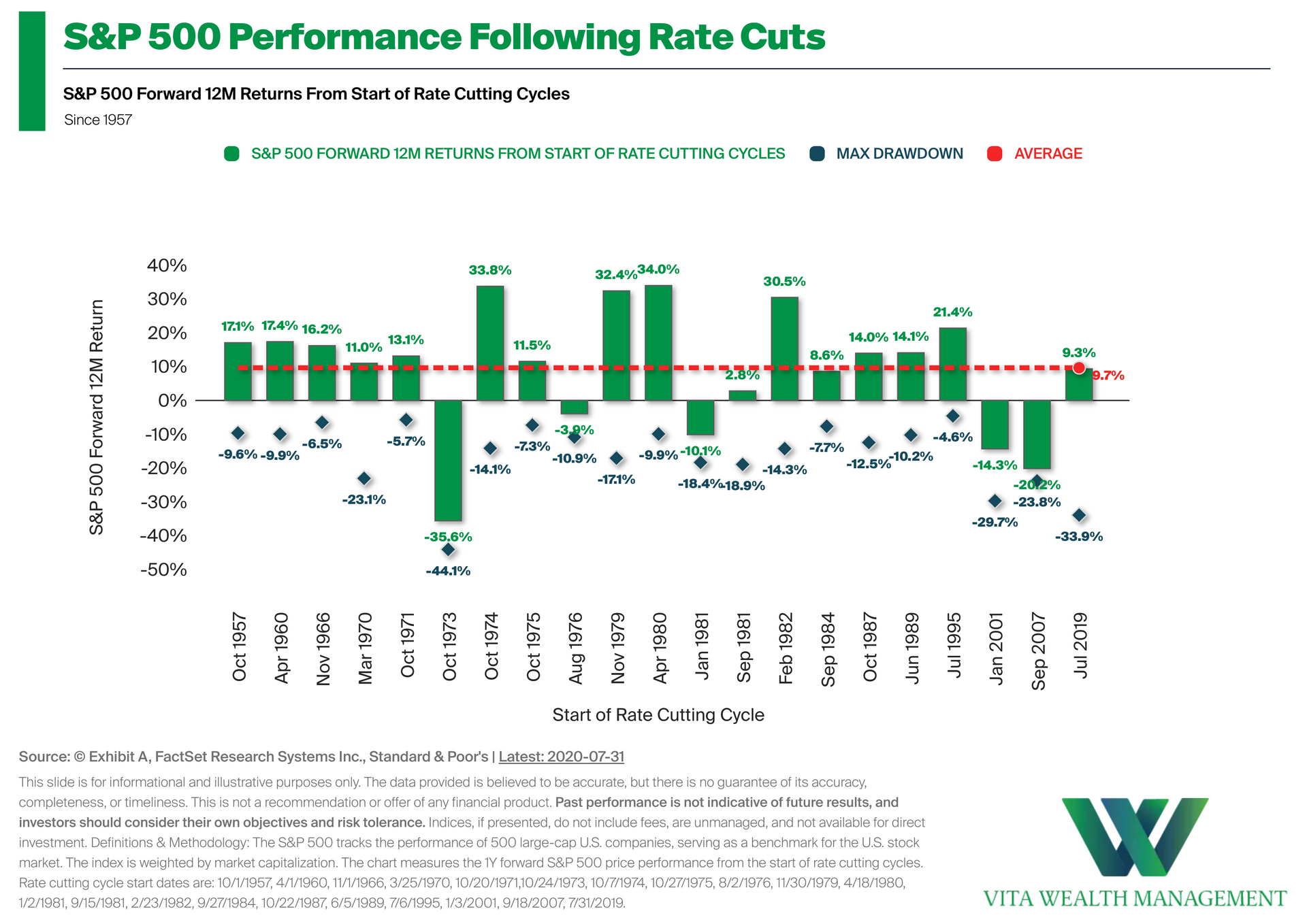
• What Do Rate Cuts Mean For The Stock Market? The chart shows S&P 500 performance in the 12 months following the start of Fed rate cutting cycles since 1957. While individual outcomes differ by cycle, rate cuts have historically coincided with near double-digit 12 month forward returns, on average. • A Look at the Data: Across all cycles, the average 12-month return following the first rate cut has been +9.7%. Results range widely, with some periods delivering strong gains and others showing declines. • Investment Implications: History suggests that rate cuts do not guarantee higher returns, but they have often been followed by positive market performance on average.